PRODUCT MANAGER ACCELERATOR
Turning Interview Anxiety into Confidence: Redesigning the AI Interviewer for PMs

This is an ongoing project, the case study will be updated at the end of February.
Overview
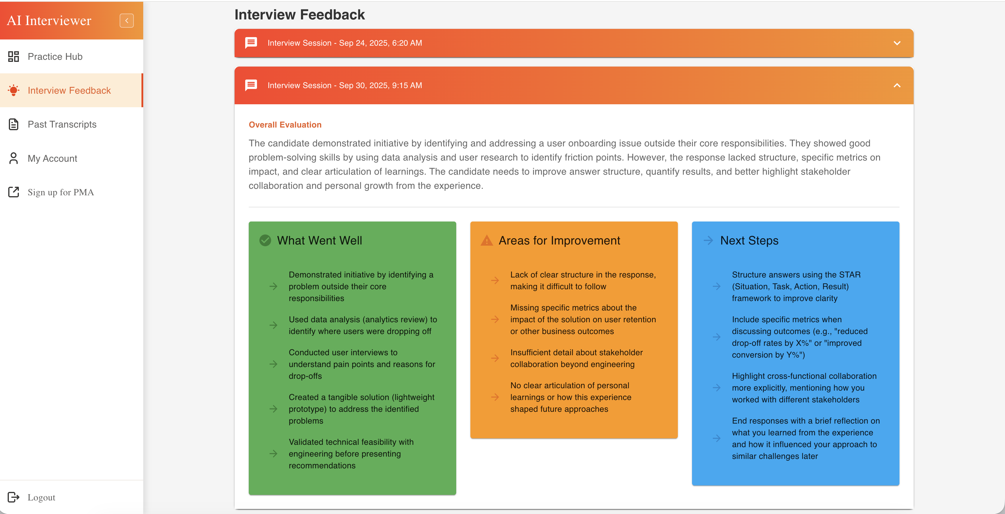
Practicely is an AI-powered interview preparation platform designed to help Product Managers get ready for interviews, by practicing Behavioral and Product Sense questions and receiving feedback.
Role
Product Designer
Responsibilities
End-to-End UX & UI Design Process and Deployment
Collaborators
Product and Engineering
Timeline
Sep 24 - Ongoing