ECHOLAB
Stepping Out of My Comfort Zone: Designing and Vibe-Coding EchoLab’s Landing Page
Overview
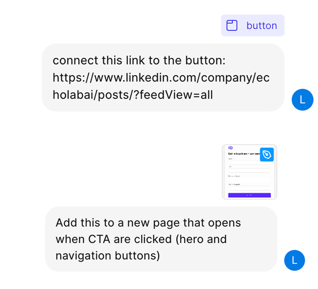
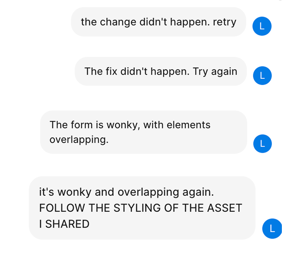
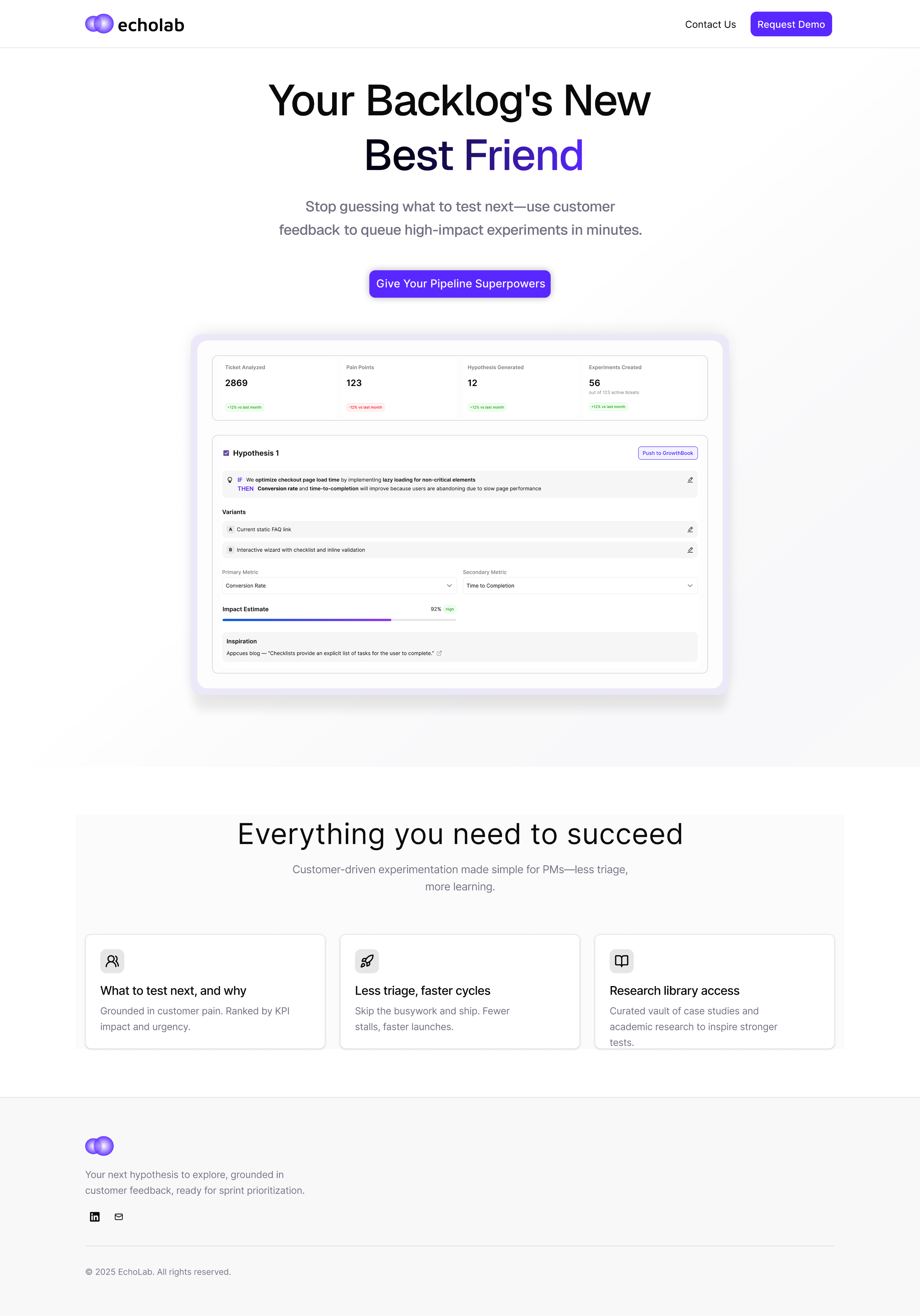
EchoLab is a ticket ingestion and A/B testing hypothesis generation platform designed to help PMs spend less time triaging and more time learning. As the MVP launch approached and engineering capacity was fully tapped, we still needed a landing page to communicate the product’s value.
I stepped in to design and vibe-code the initial landing page experience. Without established guidelines, I focused on catchy messaging, visual hierarchy, and a tone that feels exploratory yet confident. This project pushed me to trust my instincts and define the product’s identity in real time, resulting in a launch-ready page that introduces EchoLab with clarity and personality.
Role
Product Designer
Responsibilities
End-to-End UX & UI Design Process and Deployment
Collaborators
Solo Effort
Timeline
Aug 15 - 18, 2025